In the latest Bayfield Training Webinar, Sonia Martin-Gutierrez and Andri Rabetanety present: An Introduction to Visualisation Techniques for Real Estate Models. In this webinar, Andri explains how to visually audit your cash flow and effectively communicate return metrics with meaningful charts and graphics. Data visualisation is the final piece and skill set for an accomplished investment analyst. It involves communicating the risk/return profile of a real estate investment effectively through graphical means. The webinar equips you with an understanding of data visualisation theory to better communicate your real estate models’ results.
Notions of Visual Perception
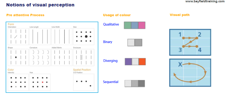
This first aspect deals with how humans interpret and perceive images. The subconscious accumulation of visual information from the environment is referred to as Pre-attentive processing. Pre-attentive processing is performed automatically on the entire visual field, detecting basic features of objects in the display. These basic features include colours, shapes, line ends, curvature, and size.
The bottom line here is simplification: try to simplify the number of colours and designs, and more generally, the ways to read a chart. Andri takes the example of the use of colour to explain this. Specifically, colour is one of the most properties used to call attention. Leveraging colours and drawing the eyes can save time and reduce the need to sift through the information.
For example, if you’re trying to represent binary data, use different ‘lightness’ steps. The use of different colours is more for different categories of qualitative data. For example, with survey data, you can use different colours to represent different answers. For sequential data, such as a scale of 1-10, use sequential steps in brightness. This helps emphasize that there is a different scale in the answer. For diverging data, use opposite colours.
In addition, it is essential to account for reading patterns to position strong elements in strategic places. Our eyes tend to explore in a ‘z’ pattern (from top left to bottom right). Consequently, that means placing the most positive outcome of your sensitivity table in your real estate model on the top left, thus, the reader starts with a positive scenario and finishes with the negative scenario.

Figure 1
Data Storytelling
Data storytelling is a structured approach for communicating data insights. It involves a combination of three key elements: data, visuals, and narrative. When narrative is coupled with data, it helps explain to your audience what is happening in the data and why a particular insight is important.
When visuals are applied to data, they can enlighten the audience to insights that they would not see without charts or graphs. Andri explains that when narrative and visuals are merged, they can engage or even entertain an audience. Three important conclusions can be made: Firstly, stories help memories. Secondly, visuals drive persuasiveness, and lastly, engagement reduces scepticism.
Finally, Andri describes the 4×4 model for knowledge content. Specifically, the 4×4 model is a framework for getting the right content to the right people at the right time. First, you have the Water Cooler (people gather around a water cooler to exchange quick snippets). Water Cooler content is direct, succinct, and compelling. Second, the Café. This is a progression from the Water Cooler content to content that explains ideas and does not just introduce them. It’s an opportunity to delve into a subject at some length but still isn’t deep study. Third, the Research Library contains the research and data that back up what is asserted at the Water Cooler and Café. It is your more scholarly, long-form content. Fourth, The Lab, you open the vaults and give users access to the data.
What is the problem statement?
In the third slide, Andri explains that you choose your chart based on the problem statement. The problem statement can be categorised in four different areas: Comparison, Distribution, Composition and Relationship.
As the name suggests, we use comparison to evaluate and compare values between two or more data points, such as the number of visitors to five competing websites in a certain period of time. A distribution tries to lay out a collection of related or unrelated information to find out how it correlates, if at all, and to understand if there’s any interaction between the variables. It can help you see the full data spectrum and visualize related or unrelated data points. With distribution, you can see if there are any correlations, trends, patterns, shapes, clusters, averages, or outliers. A composition tries to collect different types of information that make up a whole and display them together in one chart. For example, a pie chart is typically suitable when you need to visualize a part to the whole relationship. As the name suggests, relationship identifies the correlation or connection of two or more variables and their properties. A good use of relationship graphs would be to demonstrate how something does or does not affect another variable positively or negatively.
Tools to create graphics
To conclude, Andri explains the various tools used to create graphics. (1) Spreadsheet tools are used for the organization, analysis, and storage of data, such as excel or google sheets. If you are trying to control a business’s different key metrics, you would use (2) dashboard tools (e.g. Ableau). (3) Data science-based tools (e.g. Python) help create powerful data visualisation. The form or source of data is in tables that you can manipulate to build data science charts, which becomes particularly useful for creating animations. The last two types of tools are (4) infographic-based and (5) design-based tools, which form part of the design element of data presentation, including introducing specific icons.
